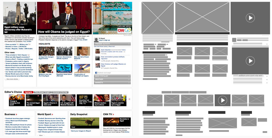
Before a website or app is released, there is a stage where the creator and the client must agree on how the end result will look, feel, and work. You don't want to get to the end of a project and your system is not looking or working how you like.
Thats where mockups come in to save the day.
We usually prefer most of them go through 1 or 2 preliminary stages, sometime even 3, to make sure that the projects we develop are exactly what the client is looking for and more. These stages allow the team, and sometimes a few select users, to test its appearance, structure, and functionality before its release. Ideally, these preliminary stages allow you to fix any problems while they’re still small, and fine-tune your project to communicate your message most clearly.
The key preliminary stage is the mockup, which is typically a mid-to-high fidelity representation of the product’s appearance, and shows the basics of its functionality. Mockups fill in the visual details (such as colors, typography, etc.) and are usually static. By looking at a mockup, you should get a good idea of how the final product will look and a rough idea of how it might function.
The wireframe (which comes before the mockup) lays the foundation and the mockup adds visual richness. While the mockup furthers the wireframe’s purpose of documentation and organizing the team’s vision, it does have an extra advantage the wireframe does not: with its superior visuals, the mockup is more impressive and close to the look of the final product, and so better at generating interest. In this way the mockup acts as the bridge between the starting idea and the finished website or app.
