Features / July 7, 2014
Time For Something Nu: The Upgrade
We always represent for the smooth, cool, and creative! It was only right that we upgraded our look to reflect the same.

Growing Up.

NuTastic has always stood for creativity in design. We officially began #teamNutastic in July of 2009, with a very simple website ( now referred to as OldTastic.net ). Back then, we spent our whole summer trying to decide on a catchy name for our design company before we decided up "NuTastic". Don't ask how we agreed upon that, or what made us think of such a phrase, we just did! With that name, and an inspiration of kid-like creativity in our system, we came up with two space / power-range esque characters ( #TBT warning ) to represent our team of two!

Over the course of the last 5 years, we’ve worked hard stay creative in our approach to design with our clients and for ourselves. We have been through 4 different websites as our creativity, style, and experience has grown and transformed. Our new iteration introduces a new level of design and style in our brand as we continue to grow professionaly and creatively.

Re-branding something Nu.

When we decided to upgrade our look, it was obvious we had to start at the logo. Over the years our 
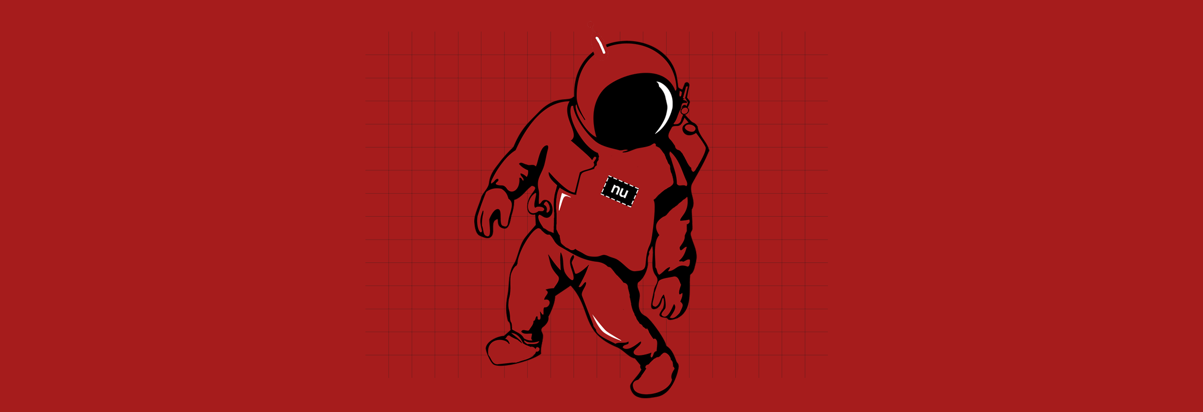
two space / power-range esque characters that represented our team became old and rusty. We knew we had to get our mascot to a look that represented the style and feel our favorite chant... "Smooth, Cool, and Creative". We took a weeks going back and forth on various helmet designs that where more modern and had a simple and clean feel to them...just in case we decide to get the helmet made for wearing one of these days! We finally agreed on the deep red helmet with a simple black visor and antenna as seen above. We took it a step futher and gave our space guy a body for various promotion purposes.

Next, we took the two dots from the two "i's" that are in "NuTastic Designz", and we placed them on chin of the space helmet, as well as above the "n" in "NuTastic", to represent the duo of our team. This was a small change, but one we felt was kind of cool in an easter-egg type of way.

We then simplified our color palette even more than it previously was. We decided to go with a deep red (which replaced the maroon), white, grey, and black. We did away with the maroon and orange color that were part of our old ways. These new colors and character logo became intertwined with our new business cards and promotions as we began the re-brandind campaign in January.

The New Nutastic.net

The concept of simple and straight-to-the-point inspired the re-design of our new site. We previously only planned on upgrading the colors of the previous website to use our new color palette, but we felt a full re-brand that put more emphasis on our portfolio was needed. The latest version of nutastic.net is designed to put work first, just like we do with our job of creating designs and websites for our amazing clients. 


As history shows, we’ll continue to grow creatively and that means our site will also continue to grow up and get better as we do the same. Remember ... the #funk never stops. #actLikeYouNu
Comments
Cool & Creative / June 25, 2015
The Fly[er] Collection
Specials / July 6, 2014
5 Years of Funk
Cool & Creative / October 9, 2014
The Cool Collection - Set 1
Cool & Creative / March 27, 2014
Cloud 12 Visions
Features / February 10, 2014
Meet Chef Just